We spent 2017 making some big changes within our company, and you, our clients, helped along the way.
Meet Keith Kamikawa, Social Media Account Manager & Visual Media Team Animator

2018 marks the 38th year of Almon Inc. We started off as a technical publications company and have grown into many other fields including animation, video production, and innovative technologies which culminated in the creation of our Visual Media team.
Looking over 2017, we’ve gained some interesting insights about our growing company and the clients we work with.
Here are a few:
Education, Technical Publications, and Power are just some of the fields our 2017 clients specialize in. What did they all want? Each client was looking for forward-facing promotional material that was attractive, made their brand stand out, and tell a story while remaining technically accurate. Sounds pretty easy, right? Well, it was hard work, but when we put the right people in a position to win and kept the lines of communication open, the solution presented itself.
One of the exciting things with having a broad client base is that we get to travel, reach out at conventions and trade shows, and talk to not only clients but educators as well. One of the special projects we worked on early in 2017 was AEM’s (Association of Equipment Manufacturers) Project AME.
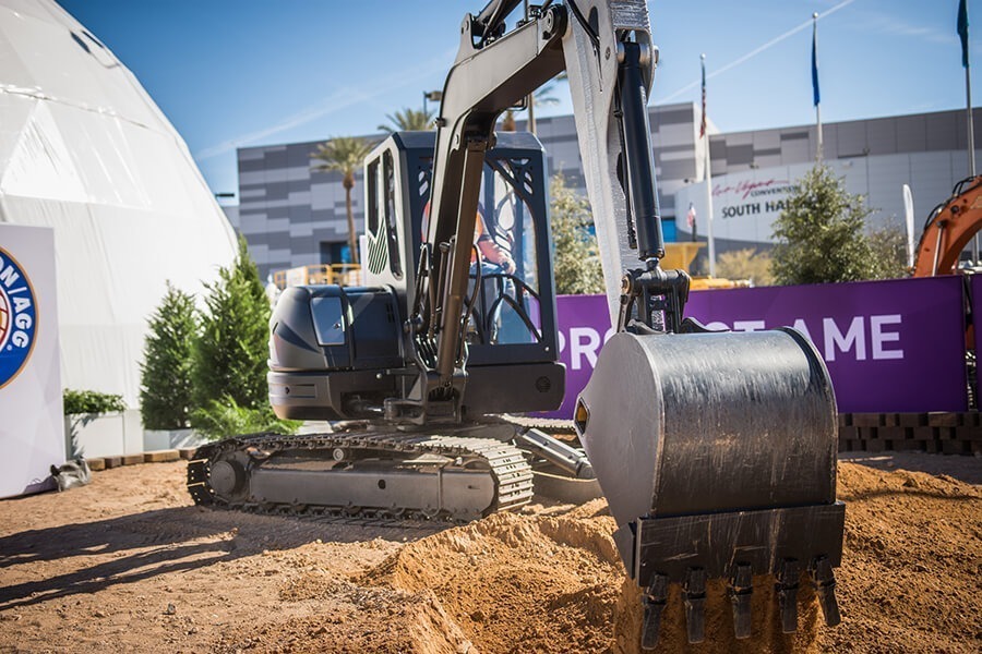
“Project AME (Additive Manufactured Excavator, pronounced “Amy”) is a revolutionary 3D printed excavator, a collaboration between AEM, the National Fluid Power Association, the Center for Compact and Efficient Fluid Power, Oak Ridge National Laboratory, the University of Minnesota, and the Georgia Institute of Technology” – equipmentworld.com
This project was a massive undertaking of technology and engineering, and the Project AME team needed someone to help tell their story.
With a recommendation from the National Fluid Power Association, the University of Minnesota reached out to us to help explain the creation and use of the 3D printed hydraulic cooler within the Project AME excavator.
Project AME was set to debut at CONEXPO-CON/AGG 2017, North America’s largest construction trade show. Working closely with the engineers of the Project AME team, and our in-house technical subject matter experts, the Visual Media team went about storyboarding what would be our longest educational animation yet.
Due to the forward-facing nature of this animation and that it was going to be a tool used during a live demonstration, it required a different approach from our normal animations.
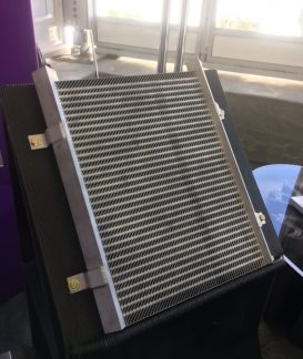
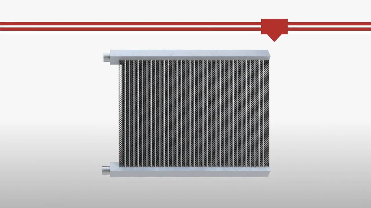
Photo of the oil cooler at CONEXPO-CON/AGG and a 3D render from the completed animation.
Beyond our 3D animation we added a heavy dose of 2D motion graphics to add text to help communicate the story, for the hearing impaired, and for visual flair. Autodesk 3DS Max took care of the realistic look of the cooler and simulation for the oil, and Adobe After Effects brought it all home with snappy motion graphics.
Project AME was a hit at CONEXPO-CON/AGG and was one of the standout announcements at this massive show. We couldn’t have been happier with how we played a part in presenting this revolutionary technology. Our team was also extremely pleased that the University of Minnesota loved what we did.
“Thanks again for all your work Almon animation team! The pop-up talks wouldn’t have had near the impact without your contribution. (Gotta be honest, you made my job easy!)” – Brandon J Hathaway, Research Associate at University of Minnesota
38 years is a long time to be in business. People, clients, and technologies have changed since we last took a look at who we are and gave ourselves a new coat of paint. How do we bring our brand in line with modern aesthetics yet keep it recognizable? That was the challenge.
We started small with color. Our Visual Media team looked at the current logo and felt the red had too much blue in it, it was too raspberry, it didn’t match with Anything. We decided to keep the overall logo and change the color. Red is a powerful color, so we went all red, rgb(165, 0, 0), for all of you RGB nerds out there.

Old Logo

New Logo
This allowed us to find a strong color pallet to work with. That’s how it started, find the one brand color and build from there. Next came our complimentary blue color, then charcoal, grays, and an accent of what we call “Sundance Yellow,”…I think it looks kinda green but what do I know?
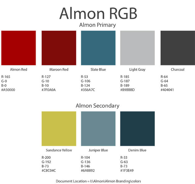
Almon Inc. web color pallet
We’re lucky to work with a bunch of Fortune 500 companies so we have a chance to use their style guides when providing work for them. They were great inspiration in thinking about basics like complimentary colors, font choices, logo rules, and feel for how we would present Almon in the future. With all of these ideas down we created our Almon style guide.
With our new style guide in hand we moved forward with creating our website. Our team went about finding sites that we enjoyed visiting to get inspiration. Sites that were easily navigable, conveyed a strong message, had a cool look, and encouraged exploration were ones that we targeted. Once we found a mix of great sites we distilled them down to find the aspects we wanted to implement in our own and started mapping it out.
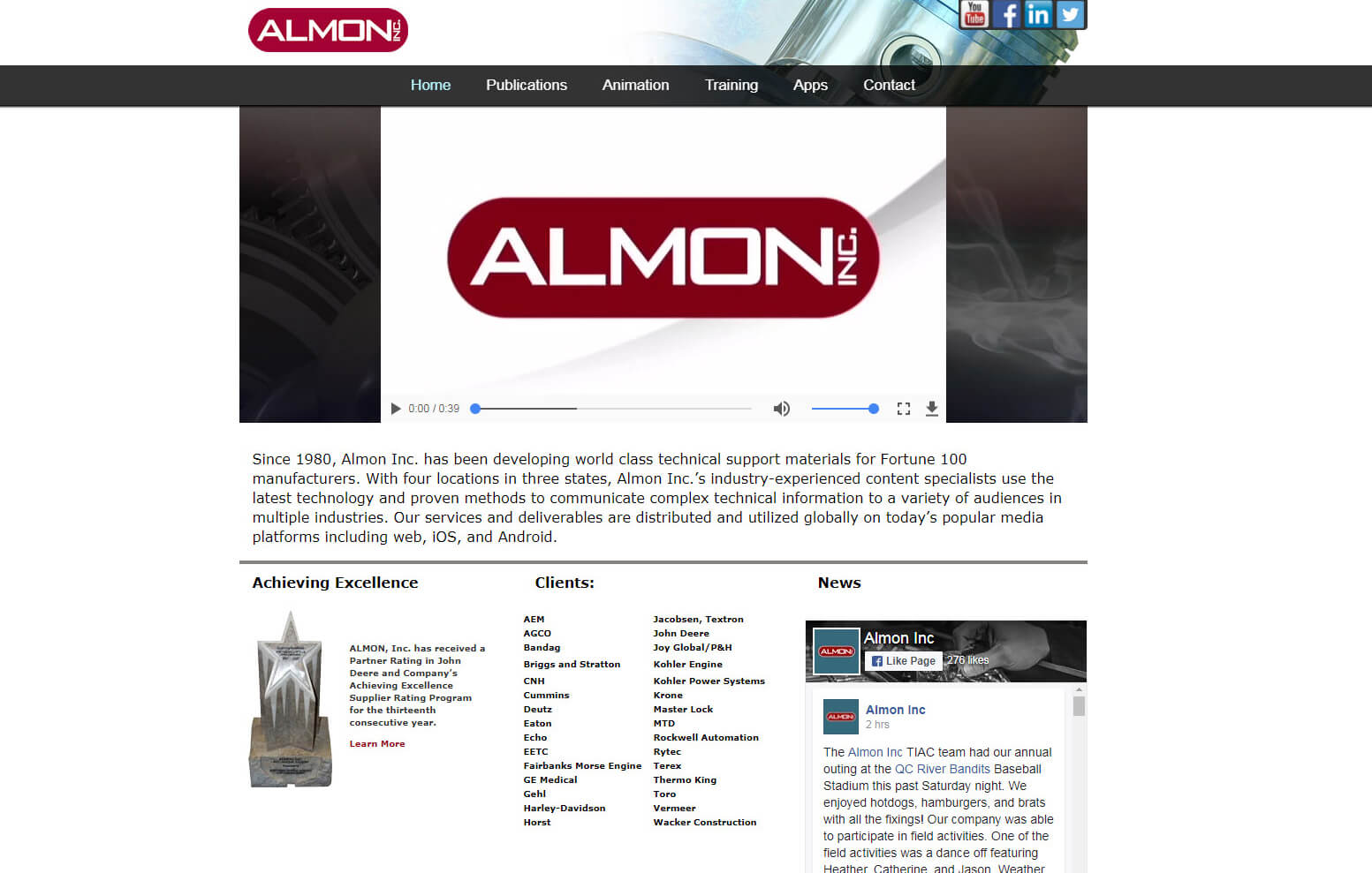
Old Website
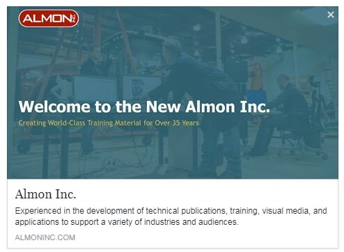
New Website
Original art assets are very important to us. Since we have the talent in illustration, graphic design, animation, photography, and video we wanted to make all of our own visuals. Clients, such as Versatile, Doosan, and Fairbanks Morse, brought validity to our site by allowing us to use their equipment and products in our visuals. Custom animations on the headers of our pages added an interesting and eye catching element we felt made our pages pop.
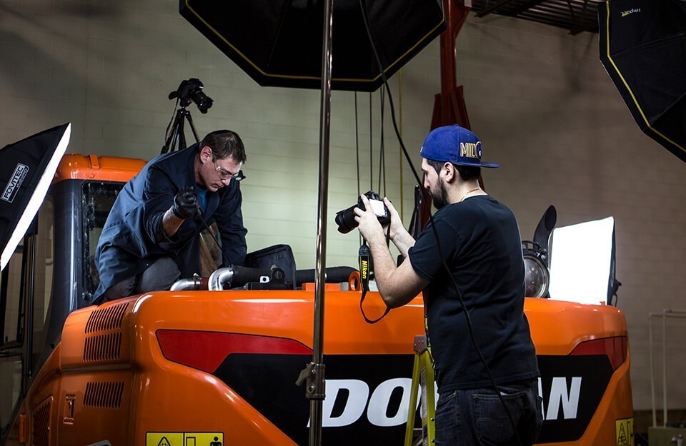
Brandon, one of our Technical Writers, and Niko, our Videographer, working on our first Doosan project of 2017
All of these factors: bold visuals and colors, a well thought out style guide, utilization of our in-house talent, and great client relationships helped create the new modern look of Almon Inc. that we’re all proud of.
It’s rare we get to work on such a large scale public facing product launch as Fairbanks Morse’s newest engine, The Trident OP.
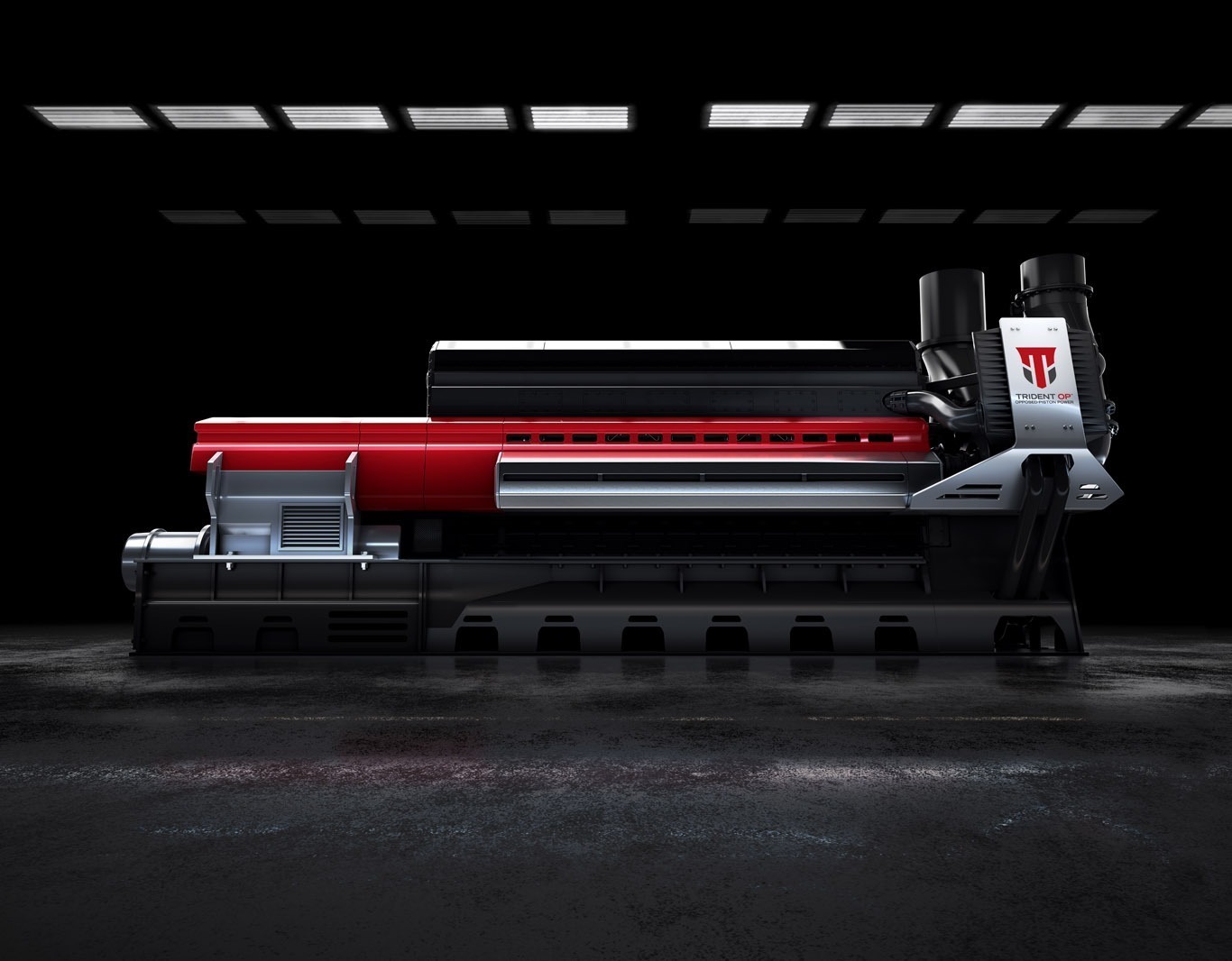
The Trident OP
Fairbanks was looking for marketing material for their latest engine set to debut at POWER-GEN International 2017. We had to create commercial quality animation of the Trident OP, giant high definition renders of the engine for their booth at POWER-GEN, and mobile application ready 3D animation of the engine in action.
Our Visual Media Team worked hand in hand with the Fairbanks Morse engineering and marketing team, as well as marketing gurus, Power Agency, and the ultra-talented design studio Brooks Stevens to create a really stunning launch for the engine.
Regular weekly meetings between all three companies, daily brainstorming and art critiques within our Visual Media Team, and a rock solid set of mood & story boards guiding the way gave us the results we were all looking for.
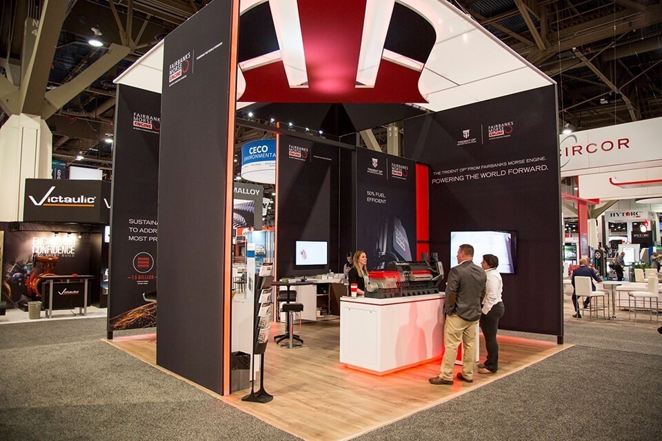
Fairbanks Morse Trident OP Booth at POWER-GEN
Cooperation between the team members from all companies helped us craft a social media campaign that performed better than any other we had previously had. Our social team was able to build out multiple topics covering everything from our animation process, technical training, our software pipeline, and storyboarding process. We were extremely proud of the work we did on the Trident OP and it was great to share it with the world thanks in great part to all of the participants.
Fairbanks Morse’s new Trident OP: From Animatic to Animation
The Fairbanks Morse Trident OP project was the culmination of all of the work our Visual Media Team did in 2017. We couldn’t be happier with the great relationships we made and how the final art turned out. Please look forward to a future blog by our Senior Animator, Tom Weber, where he will go in depth on this milestone project.
2017 brought us a new look, new clients, and exciting forward facing projects that helped us promote ourselves and our clients. 2018 is shaping up to be just as big. Thanks to our hard work, and our great client relationships of 2017, the Visual Media Team has the largest first quarter of work lined up we’ve ever had. The exciting part is the diversity of projects ranging from product launch marketing animations, robust eLearning art assets, technical training videos and photography, and even AR/VR projects.
Maybe it’s a given that when you assemble the right team, plan ahead, and encourage creativity great things happen, but it’s awesome to see it happen. 2017 was such a great year for our Visual Media Team, we can’t wait to get rolling in 2018. Join us for the ride, it’ll be great.
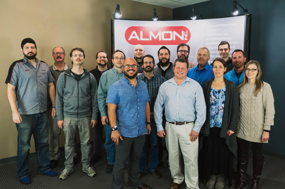
Almon’s Training and Animation Facility Team


